
Hiệu ứng con trỏ chuột, di chuyển theo chuột với Mousemove Event
Giới thiệu và sơ lược về kết quả
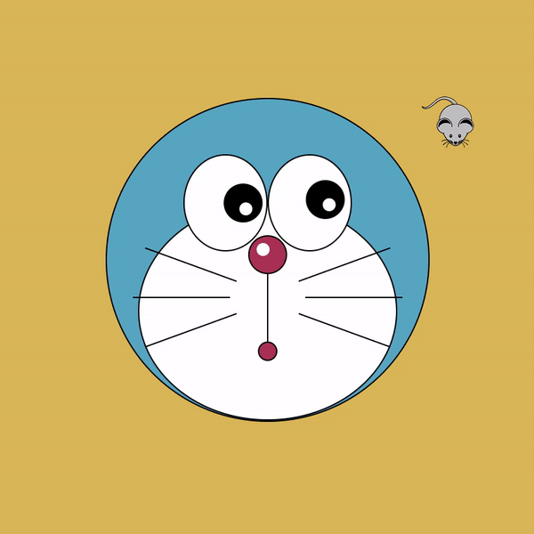
Sau khi các bạn xem xong bài viết này có thể nắm được sơ lược về cách sử dụng mousemove event trong js, từ đó chúng ta có thể tạo nên nhiều các hiệu ứng cũng như áp dụng vào các dự án khác.Dưới đây là sơ lược về kết quả của bài viết này :

Trước tiên chúng ta tải file hình ảnh con trỏ: https://github.com/trananhtuat/doraemon-eyes-follow-mouse-cursor/blob/main/mouse.png
Tạo file có đuôi .html
<!DOCTYPE html>
<html lang="en">

<head>
  <meta charset="UTF-8">
  <meta http-equiv="X-UA-Compatible" content="IE=edge">
  <meta name="viewport" content="width=device-width, initial-scale=1.0">
  <title>Document</title>
  <link rel="stylesheet" href="./style.css">
</head>

<body>

  <div class="container">
    <div class="doraemon">
      <div class="face">
        <div class="white">
          <div class="eye left">
            <div class="eye-black"></div>
          </div>
          <div class="eye right">
            <div class="eye-black"></div>
          </div>
          <div class="nose"></div>
          <div class="mouth"></div>
          <div class="mustache left"></div>
          <div class="mustache two left"></div>
          <div class="mustache three left"></div>
          <div class="mustache right"></div>
          <div class="mustache two right"></div>
          <div class="mustache three right"></div>
        </div>
      </div>
    </div>
  </div>

  <script src="./app.js"></script>
</body>

</html>
Tiếp theo chúng ta tạo file có đuôi .css
:root {
  --bg: #ddb551;
  --main-color: #51a1c4;
  --red: #b13f54;
  --black: #000000;
  --white: #ffffff;
}

* {
  padding: 0;
  margin: 0;
  box-sizing: border-box;
}

.container {
  height: 100vh;
  display: flex;
  align-items: center;
  justify-content: center;
  background-color: var(--bg);
  cursor: url('./mouse.png'), default;
}

.doraemon {
  --size: 500px;
  width: var(--size);
  height: var(--size);
  position: relative;
}

.face {
  width: 100%;
  height: 100%;
  background-color: var(--main-color);
  border-radius: 50%;
  border: 2px solid var(--black);
  position: relative;
  transition: background-color 1s ease;
}

.face:hover {
  background-color: #d6c2e8;
  transition: background-color 5s ease;
}

.white {
  --size: 400px;
  width: var(--size);
  height: calc(var(--size) - 62px);
  position: absolute;
  bottom: 0;
  left: calc(50% - var(--size) / 2);
  background-color: var(--white);
  border-radius: 50%;
  border: 2px solid var(--black);
}

.eye {
  width: 130px;
  height: 150px;
  border-radius: 100%;
  background-color: var(--white);
  border: 2px solid var(--black);
  position: absolute;
  top: -75px;
}

.eye.left {
  left: calc(50% - 130px);
}

.eye.right {
  right: calc(50% - 130px);
}

.eye-black {
  --size: 60px;
  width: var(--size);
  height: var(--size);
  border-radius: 50%;
  background-color: var(--black);
  position: absolute;
  bottom: 0;
  left: calc(50% - var(--size) / 2);
  transform-origin: top;
}

.eye-black::after {
  content: "";
  --size: 20px;
  width: var(--size);
  height: var(--size);
  border-radius: 50%;
  background-color: var(--white);
  position: absolute;
  left: 10px;
  top: calc(50% - 10px);
}

.nose {
  --size: 60px;
  width: var(--size);
  height: var(--size);
  background-color: var(--red);
  border: 2px solid var(--black);
  border-radius: 50%;
  position: absolute;
  left: calc(50% - var(--size) / 2);
  top: 50px;
}

.nose::after {
  --size: 20px;
  content: "";
  width: var(--size);
  height: var(--size);
  border-radius: 50%;
  background-color: var(--white);
  position: absolute;
  top: 10px;
  left: 20%;
}

.mouth {
  --size: 30px;
  width: var(--size);
  height: var(--size);
  border-radius: 50%;
  border: 2px solid var(--black);
  position: absolute;
  bottom: 90px;
  left: calc(50% - var(--size) / 2);
  background-color: var(--red);
  transform-origin: top;
  transition: all 1s ease;
}

.face:hover .mouth {
  border-bottom: 0px;
  width: calc(var(--size) * 6);
  left: calc(50% - var(--size) * 6 / 2);
  transition: all 4s ease;
}

.mouth::before {
  content: "";
  width: 2px;
  height: 106px;
  background-color: var(--black);
  position: absolute;
  bottom: 100%;
  left: calc(50% - 1px);
}

.mustache {
  position: absolute;
  height: 2px;
  width: 150px;
  top: 120px;
  background-color: var(--black);
}

.mustache.left {
  left: 0px;
  transform-origin: right;
  transform: rotate(20deg);
}

.mustache.right {
  right: 0px;
  transform-origin: left;
  transform: rotate(-20deg);
}

.mustache.two {
  top: 145px;
}

.mustache.three {
  top: 170px;
}

.mustache.left.two {
  left: -10px;
  transform: rotate(0deg);
}

.mustache.left.three {
  left: 0px;
  transform: rotate(-20deg);
}

.mustache.right.two {
  right: -10px;
  transform: rotate(0deg);
}

.mustache.right.three {
  right: 0px;
  transform: rotate(20deg);
}
Tiếp theo chúng ta tạo thêm file javacript có đuôi .js
const body = document.querySelector('body')

body.addEventListener('mousemove', (event) => {
  const eyes = document.querySelectorAll('.eye-black')

  eyes.forEach(eye => {
    const x = eye.getBoundingClientRect().left + eye.clientWidth / 2
    const y = eye.getBoundingClientRect().top + eye.clientHeight / 2

    const radian = Math.atan2(event.pageX - x, event.pageY - y)
    const rotate = radian * (180 / Math.PI) * -1

    eye.style.transform = `rotate(${rotate}deg)`

  })
})
Lưu lại và trải nghiệm ngay thôi nào các bạn.
Thông tin chi tiết
- Tên file:
- Hiệu ứng con trỏ chuột, di chuyển theo chuột với Mousemove Event
- Phiên bản:
- N/A
- Tác giả:
- Trananhtuat
- Website hỗ trợ:
- https://github.com/trananhtuat
- Thuộc chủ đề:
- Javacript
- Gửi lên:
- 11/08/2022 02:53
- Cập nhật:
- 05/09/2022 02:52
- Người gửi:
- admin
- Thông tin bản quyền:
- N/A
- Dung lượng:
- N/A
- Xem:
- 562
- Tải về:
- 1
Tải về
Từ github.com:
Đánh giá
Bạn đánh giá thế nào về file này?
Hãy click vào hình sao để đánh giá File
Ý kiến bạn đọc
Bạn cần đăng nhập với tư cách là Thành viên chính thức để có thể bình luận
Hỏi đáp với tôi
close- smart_toy Hi there 👋 How can I help you today?
send