
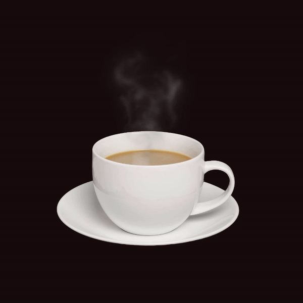
Chia sẻ hiệu ứng khói bay html & css miễn phí
1. Phần HTML
https://github.com/trananhtuat/css-smoke-effect/tree/main/assets
<!DOCTYPE html>
<html lang="en">

<head>
  <meta charset="UTF-8">
  <meta http-equiv="X-UA-Compatible" content="IE=edge">
  <meta name="viewport" content="width=device-width, initial-scale=1.0">
  <title>Smoke effect</title>
  <link rel="stylesheet" href="./index.css">
</head>

<body>

  <div class="cup-wrap">
    <div class="cup">
      <img src="./assets/cup.png" alt="cup">
    </div>

    <div class="smoke-wrap">
      <img class="smoke" src="./assets/smoke.png" alt="smoke">
    </div>
    <div class="smoke-wrap">
      <img class="smoke2" src="./assets/smoke.png" alt="smoke">
    </div>
    <div class="smoke-wrap">
      <img class="smoke3" src="./assets/smoke.png" alt="smoke">
    </div>
  </div>

</body>

</html>
2. Phần CSS
* {
  padding: 0;
  margin: 0;
  box-sizing: border-box;
}

body {
  height: 100vh;
  display: flex;
  align-items: center;
  justify-content: center;
  background-color: #160e0e;
}

img {
  max-width: 100%;
}

.cup-wrap {
  width: 500px;
  height: 600px;
  position: relative;
}

.cup {
  position: absolute;
  bottom: 0;
}

.smoke-wrap {
  position: absolute;
  left: 50%;
  transform: translateX(-50%);
  bottom: 222px;
}

.smoke,
.smoke2,
.smoke3 {
  filter: blur(5px);
  transform-origin: 50% 50%;
}

.smoke {
  animation: smoke1 3s linear infinite;
  animation-delay: 0.5s;
}

.smoke2 {
  animation: smoke2 3s linear infinite;
  animation-delay: 1.5s;
}

.smoke3 {
  width: 500px;
  animation: smoke3 4s linear infinite;
  animation-delay: 2.5s;
}

@keyframes smoke1 {
  0% {
    filter: blur(0px);
    transform: translateY(0px) scale(-1, 1);
    opacity: 0;
  }

  25% {
    filter: blur(3px);
    transform: translateY(-10px) scale(-1, 1.05);
    opacity: 0.5;
  }

  50% {
    filter: blur(5px);
    transform: translateY(-20px) scale(-1, 1.1);
    opacity: 1;
  }

  75% {
    filter: blur(5px);
    transform: translateY(-30px) scale(-1, 1.15);
    opacity: 0.5;
  }

  100% {
    filter: blur(7px);
    transform: translateY(-40px) scale(-1, 1.2);
    opacity: 0;
  }
}

@keyframes smoke2 {
  0% {
    filter: blur(0px);
    transform: translateY(0px) scale(1);
    opacity: 0;
  }

  25% {
    filter: blur(3px);
    transform: translateY(-10px) scale(1.05);
    opacity: 0.5;
  }

  50% {
    filter: blur(5px);
    transform: translateY(-20px) scale(1.1);
    opacity: 1;
  }

  75% {
    filter: blur(5px);
    transform: translateY(-30px) scale(1.15);
    opacity: 0.5;
  }

  100% {
    filter: blur(7px);
    transform: translateY(-40px) scale(1.2);
    opacity: 0;
  }
}

@keyframes smoke3 {
  0% {
    filter: blur(0px);
    transform: translateY(0px) scale(1);
    opacity: 0;
  }

  25% {
    filter: blur(3px);
    transform: translateY(-20px) scale(1.05);
    opacity: 0.5;
  }

  50% {
    filter: blur(5px);
    transform: translateY(-40px) scale(1.1);
    opacity: 1;
  }

  75% {
    filter: blur(5px);
    transform: translateY(-60px) scale(1.15);
    opacity: 0.5;
  }

  100% {
    filter: blur(7px);
    transform: translateY(-80px) scale(1.2);
    opacity: 0;
  }
}
Và tải thêm hình ảnh của ly cafe và khói ở đâyhttps://github.com/trananhtuat/css-smoke-effect/tree/main/assets
Thông tin chi tiết
- Tên file:
- Chia sẻ hiệu ứng khói bay html & css miễn phí
- Phiên bản:
- v1
- Tác giả:
- trananhtuat
- Website hỗ trợ:
- https://github.com/trananhtuat
- Thuộc chủ đề:
- Html & Css
- Gửi lên:
- 06/08/2022 08:59
- Cập nhật:
- 06/08/2022 08:59
- Người gửi:
- admin
- Thông tin bản quyền:
- N/A
- Dung lượng:
- N/A
- Xem:
- 400
- Tải về:
- 0
Tải về
Từ github.com:
Đánh giá
Bạn đánh giá thế nào về file này?
Hãy click vào hình sao để đánh giá File
Ý kiến bạn đọc
Bạn cần đăng nhập với tư cách là Thành viên chính thức để có thể bình luận
Hỏi đáp với tôi
close- smart_toy Hi there 👋 How can I help you today?
send